

Brand Experience Case Study
From Digital Design to Physical Brand Experience
BRANDING & PRINT PRODUCTION / CORPORATE IDENTITY
27 August, 2026

1. The Challenge: A Strong Brand That Wasn't Translating to Print
The company had already invested in building a modern and professional visual identity. Its logo looked polished digitally, the website was well presented, and the overall brand had a strong foundation.
However, the same consistency was missing when the brand moved from screen to print. Business cards, letterheads, envelopes, and carry bags were being produced through different vendors, resulting in noticeable differences in colour, proportions, spacing, and overall finish.
"What looked professional on a screen did not always feel equally professional in the hands of a customer."
2. The Core Problem
The issue wasn't the existence of a logo or brand identity. The issue was inconsistent execution across physical brand assets.
Existing Brand Foundation
Modern visual identity, polished digital logo, well-presented website, and strong brand foundation already established.
Inconsistent Physical Execution
Different vendors interpreting design differently, unstandardised print specifications, and no clear production system.
Different vendors were interpreting the design differently. Print specifications were not standardised, and there was no clear production system to ensure consistency across materials.
The objective was therefore not to reinvent the brand, but to strengthen its visual system and create a consistent print experience across every customer touchpoint.
3. Our Approach: Turning the Brand into a Scalable Print System
Rather than simply sending existing artwork to a printer, we approached the project from both a brand and production perspective. The focus was on creating a visual system that would remain consistent across different materials, sizes, and printing processes.
01
Simplifying the Visual Identity
The original identity contained several visual elements that became difficult to reproduce consistently in physical applications. We refined the overall presentation by reducing unnecessary effects, visual clutter, and overly complex treatments. The goal was simple: make the brand cleaner, stronger, and easier to reproduce.
02
Establishing a Premium 2D Identity
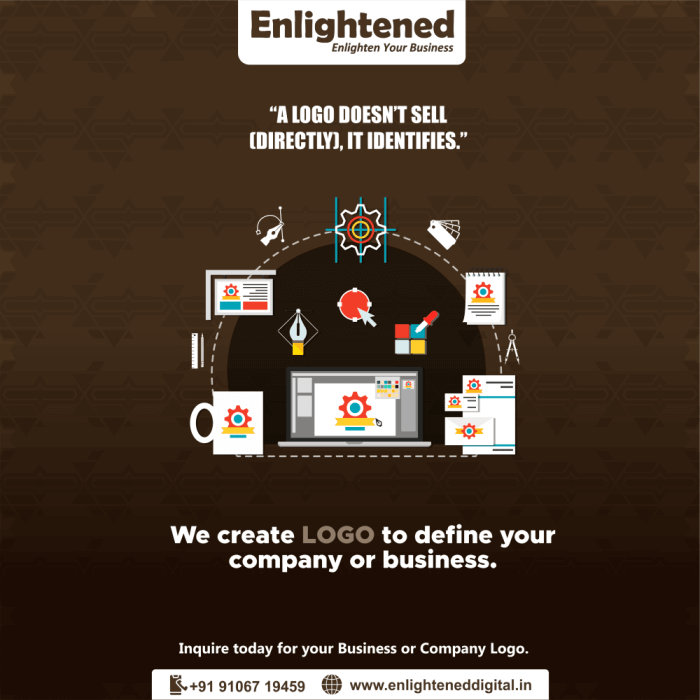
The logo was adapted into a clean, structured 2D treatment that could work effectively across both corporate and retail applications. A simplified identity provided greater flexibility across business cards, letterheads, envelopes, packaging, carry bags, signage, and other branded materials.
03
Creating Consistent Layout Standards
Consistency goes beyond using the same logo. We established clear rules for logo placement, spacing and alignment, typography, information hierarchy, proportions, and print margins and bleed. This created a repeatable system rather than a collection of individual designs.
04
Preparing the Brand for Production
A key part of the project was making sure the artwork was not only visually correct, but also technically suitable for print production. We standardised the artwork for professional printing, including CMYK colour setup, print-safe layouts, correct bleed and trim areas, high-resolution artwork, consistent logo proportions, and production-ready files.

4. The Turning Point: From Artwork to Brand Experience
The difference became most visible during the physical production stage. Once the layouts, colours, typography, and specifications were standardised, the materials immediately felt more cohesive.
"The objective was not to make every item look identical. It was to make every item feel like it belonged to the same brand."
From the business card handed across a meeting table to the envelope used for a proposal and the carry bag given to a customer, the visual language remained consistent. That consistency created a stronger and more premium brand experience.
5. Managing the Physical Brand Touchpoints
Premium Visiting Cards
A clean and minimal layout combined with an appropriate paper stock and finish created a more refined first impression.
Corporate Letterheads
The letterhead was designed to balance professionalism and readability while using suitable paper specifications to add a more substantial physical feel.
Custom Envelopes
The envelope design extended the same identity system to an often-overlooked customer touchpoint, creating consistency even before the document inside was opened.
Branded Carry Bags
The carry bags were intentionally kept clean and uncluttered, using strong typography and the simplified logo treatment to create a professional and recognisable retail presence.
6. The Result: A More Consistent and Premium Brand Presence
The biggest improvement was not one individual printed asset. It was the consistency of the entire brand experience.
The company could now present the same visual identity across its major physical communication materials without the inconsistencies that previously weakened the overall presentation.
7. From Fragmented Printing to Controlled Brand Execution
| Area | Previously | After Our Approach |
|---|---|---|
| Design | Primarily screen-focused artwork | Developed with print applications in mind |
| Colour | Variations between vendors and materials | Standardised CMYK colour specifications |
| Layout | Different placement and spacing across assets | Consistent alignment and spacing rules |
| Production | Multiple vendors interpreting designs independently | Clearly prepared, production-ready artwork |
| Brand Experience | Inconsistent physical presentation | Cohesive identity across touchpoints |
| Overall Perception | Professional digitally, inconsistent physically | Stronger and more premium overall presence |
8. The Business Impact
A brand doesn't stop at the website. It appears on the business card someone keeps in their wallet. It appears on the letterhead carrying an important proposal. It appears on the envelope delivered to a business partner. It appears on the bag a customer carries outside the store.
Every one of these interactions contributes to the perception of the company.
By bringing these touchpoints under one consistent visual system, the business was able to present itself with greater confidence and professionalism across both digital and physical channels.
The Key Takeaway
"Good branding is not just about how a logo looks on a screen. It is about how consistently that identity lives in the real world."
A strong visual identity can lose its impact when execution is inconsistent. Our role was to bridge that gap - taking an existing brand foundation and turning it into a structured, scalable, and production-ready physical identity.
The result was not simply better printing. It was a more cohesive brand experience.















© Copyright , All Rights Reserved.